Food & Beverage
Everything you need, on the page you buy from
Everything you need, on the page you buy from case study, Food & Beverage web design and UI/UX project by Neelaka Ganegoda.
Overview
RaaLa Kithul sells treacle, jaggery and flour made from wild kithul palms around Neluwa, on the edge of the Sinharaja rainforest. I buy from them, through their website. This is a redesign I started on my own after a few of those orders, then pitched to the brand. They did not take it up, so it lives on my subdomain as a concept, with a demo checkout and a banner on every page pointing to the real store.
The Challenge
The product is good and the store makes it hard to buy. The product page shows the price with only the Sinhala rupee sign, which a buyer in London or Toronto cannot read as a currency. It lists two different weights for the same bottle. The brand names partners in nine countries and four local supermarket chains, yet a shop or importer has no way in. The redesign had to serve a home cook ordering one bottle and a buyer ordering cartons, on the same pages, with neither pushed below the other.
Pain Points
- 01
A price export buyers cannot read
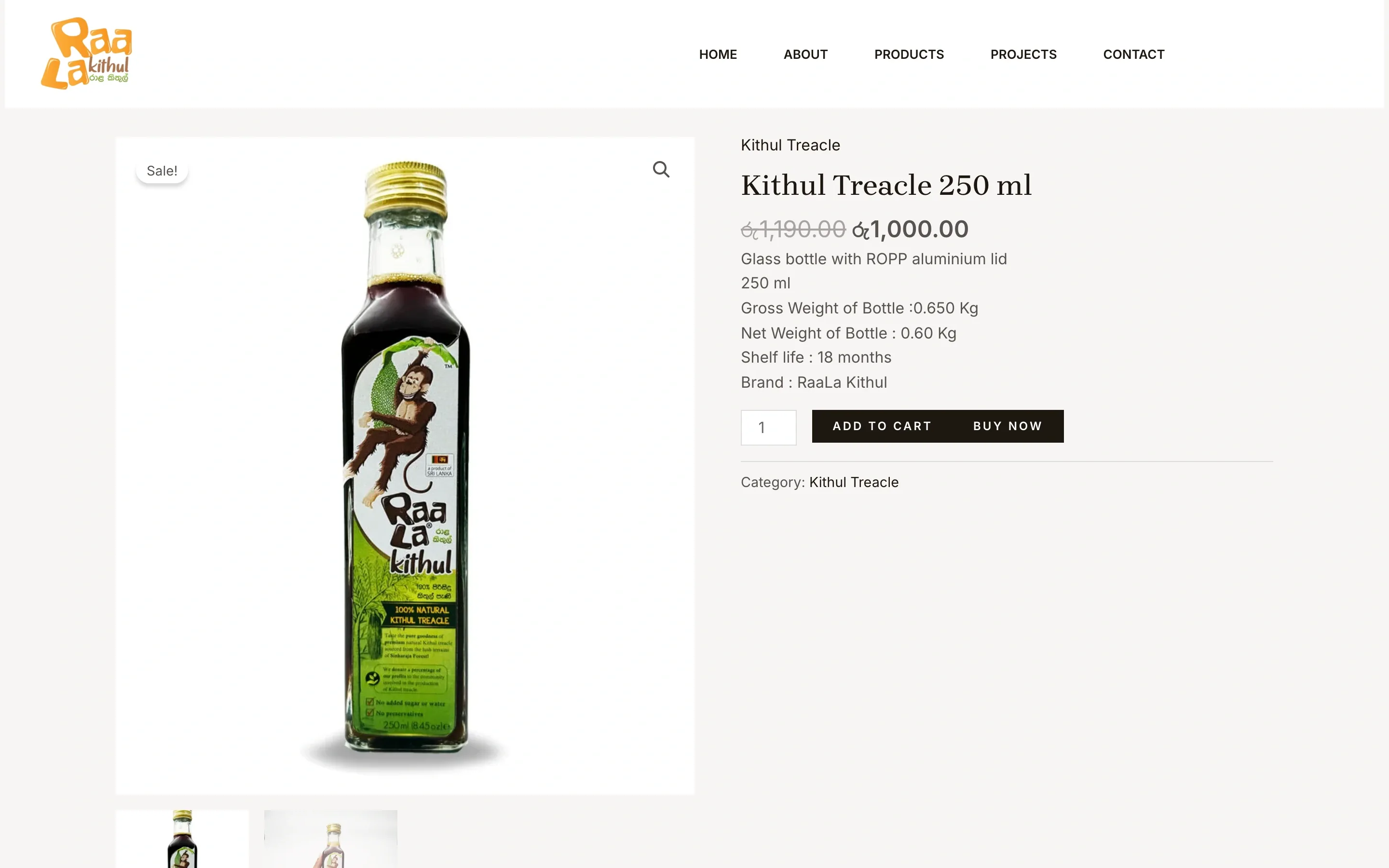
The product page shows රු1,000.00 with no currency code. For the buyers abroad that the brand ships to, the symbol does not say which currency it is, let alone what the bottle costs in theirs.
- 02
Facts that contradict each other
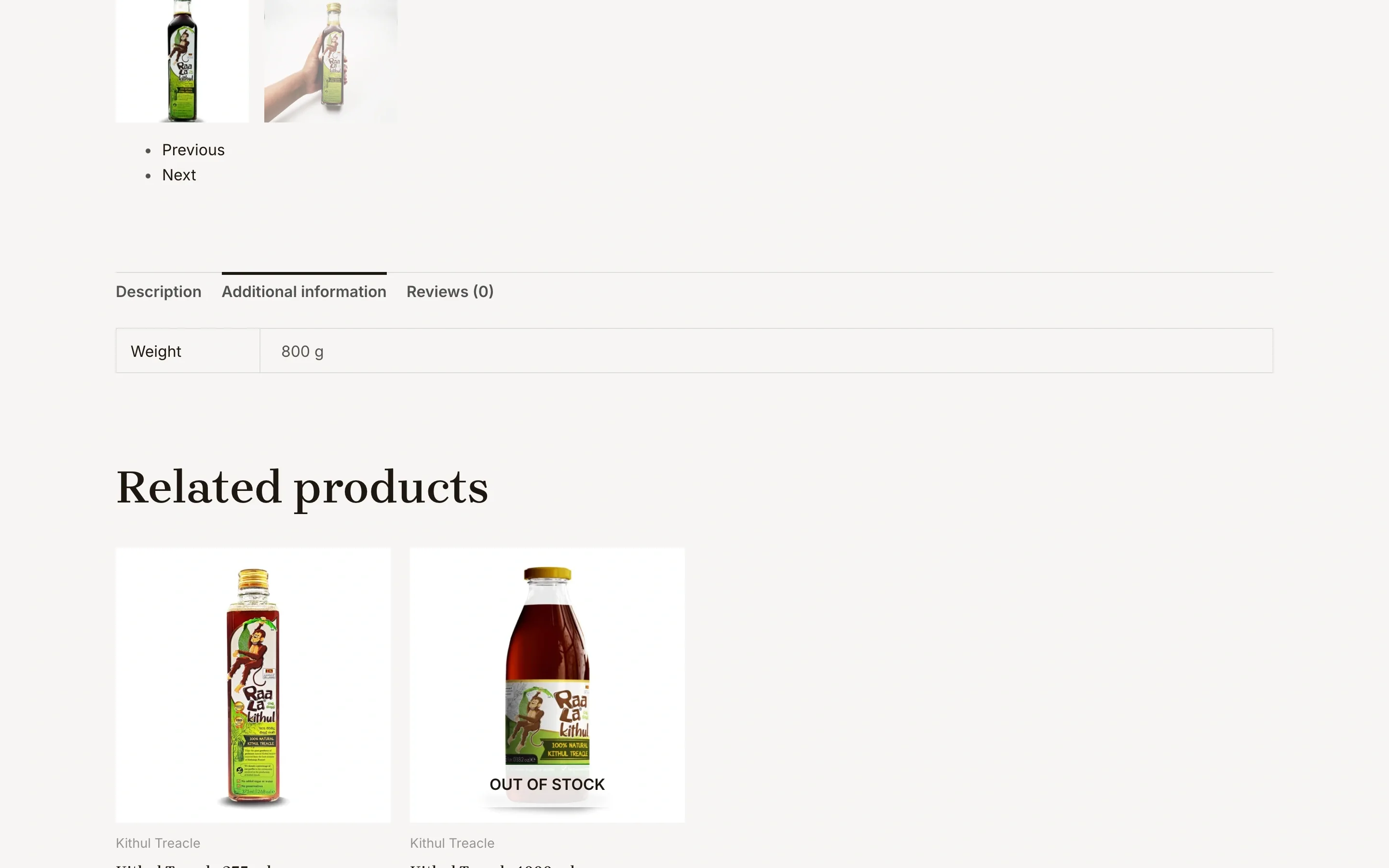
The 250 ml bottle weighs 800 g in one tab and 0.65 kg gross, 0.60 kg net in the specs above it. A related bottle shows a 5.00 rating on a page whose own tab reads Reviews (0). Each one is small. Together they make a buyer doubt the rest.
- 03
Nothing on the page to decide with
No ingredients, no nutrition, no storage, no shipping or returns information. The product page asks for the order before it answers a single question about the bottle.
- 04
No way in for trade buyers
The homepage lists partners in nine countries and supermarket clients at home, and gives a shop or importer no pack sizes, no minimum order and no form to ask.
Solutions
- 01
Everything needed to order, in one column
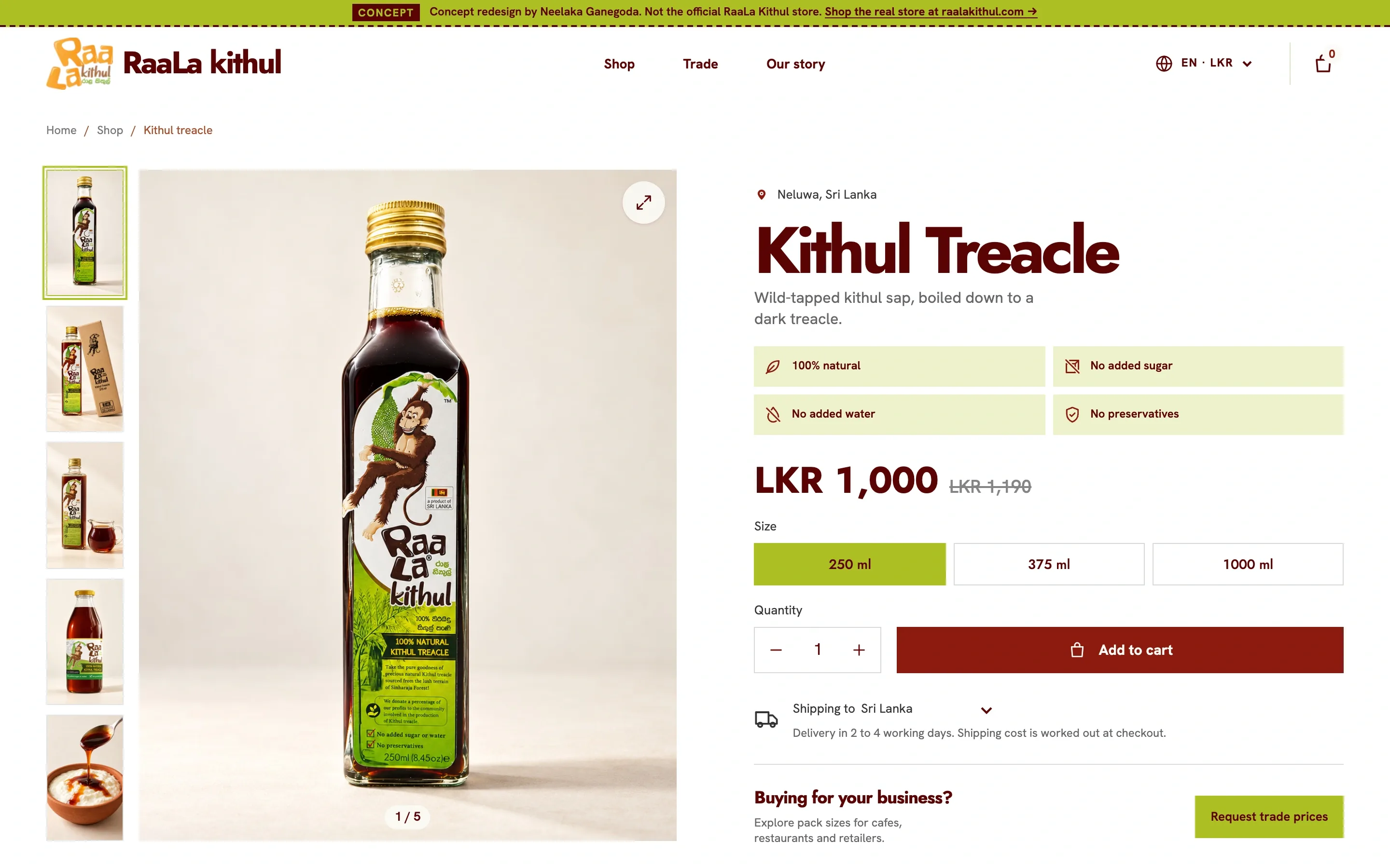
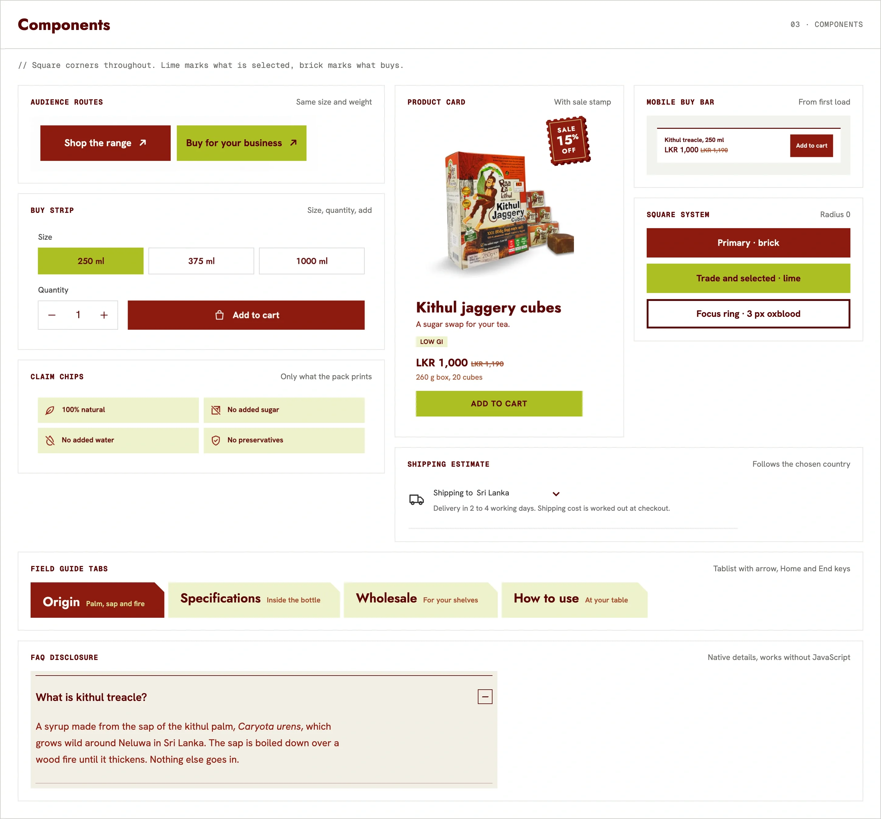
Origin, four plain claims, the price with the sale price struck through, three sizes, quantity, Add to cart, a shipping estimate for the chosen country and a short trade prompt, all beside the gallery.
- 02
One ingredient, stated once
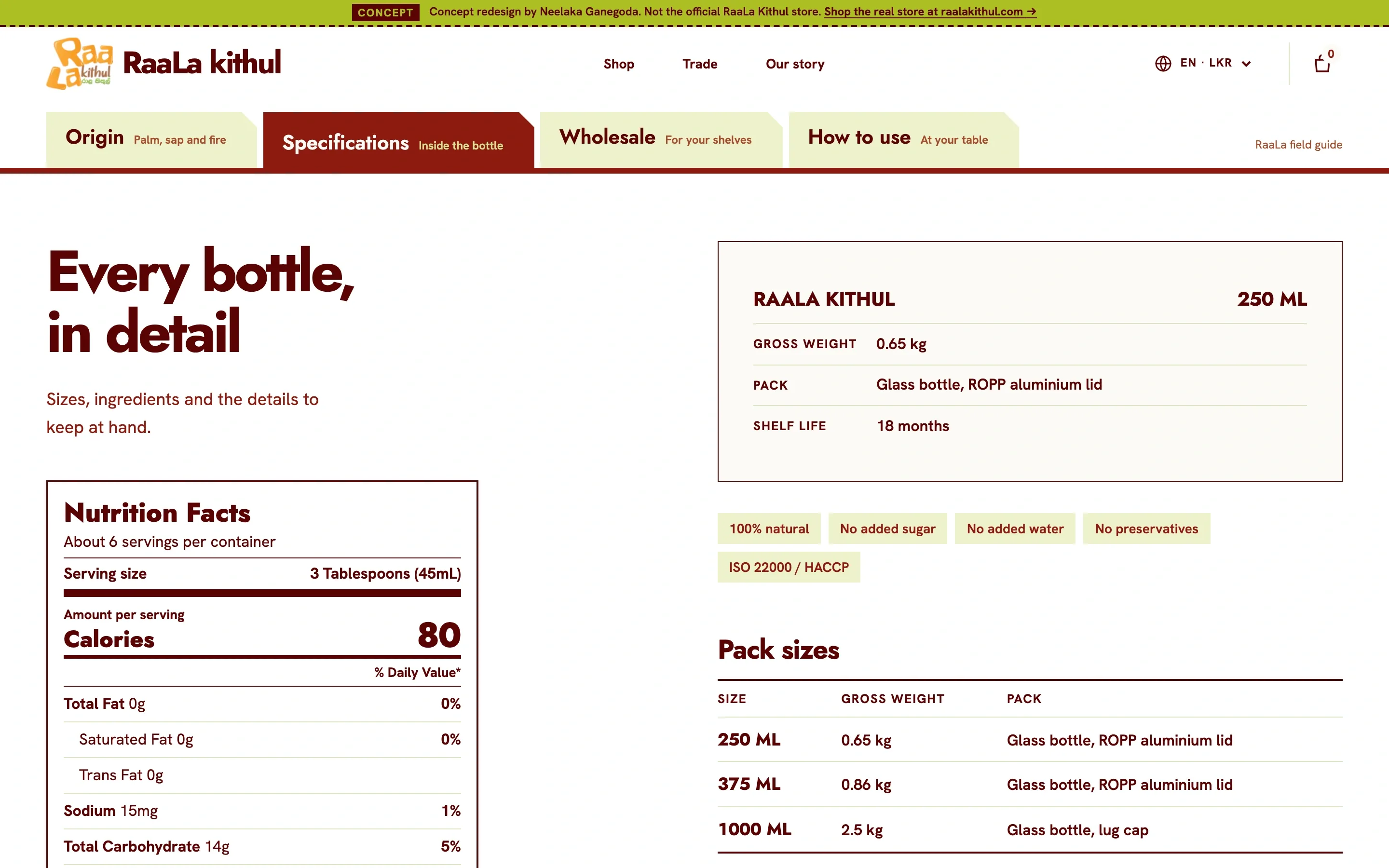
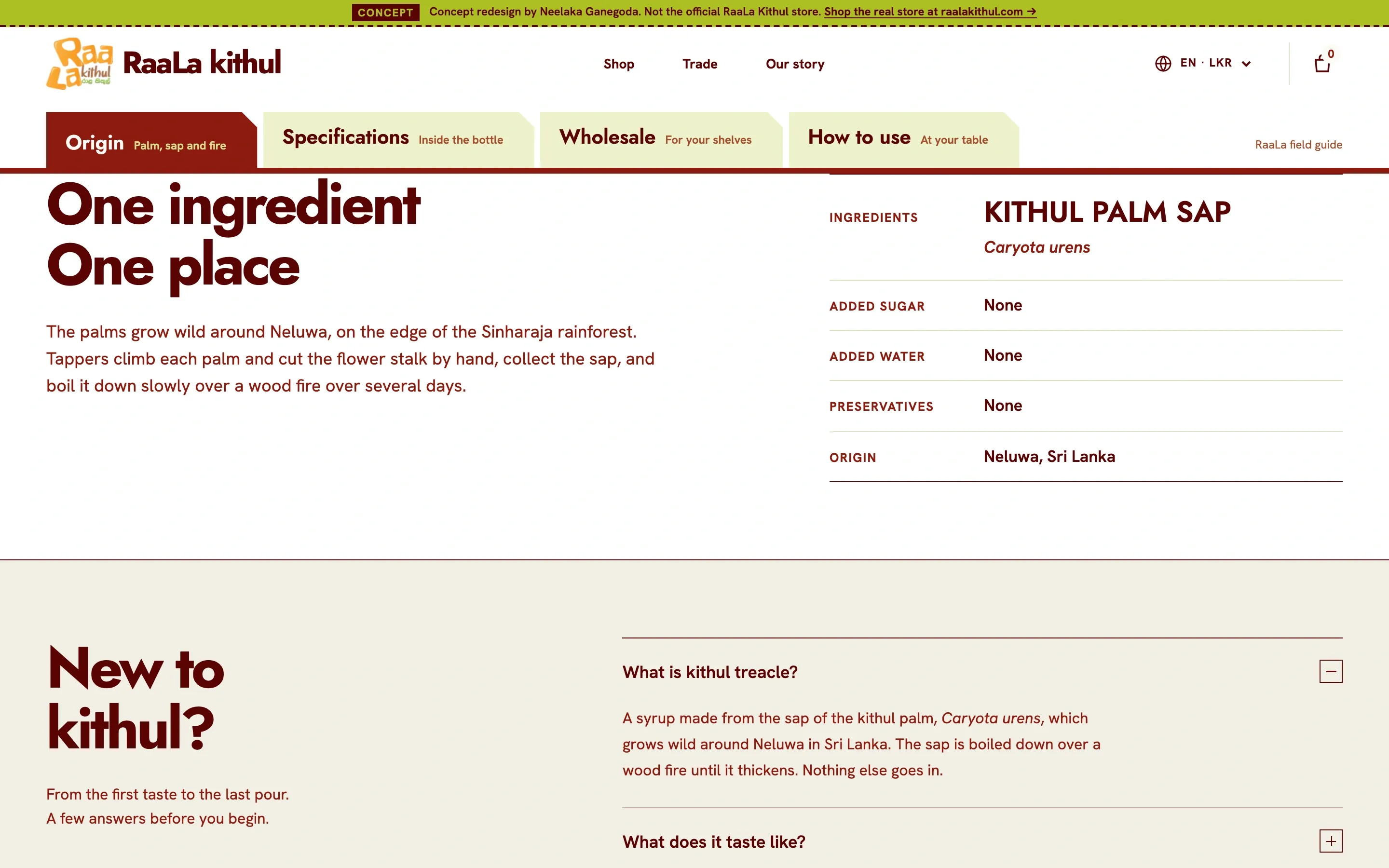
An ingredient table that lists kithul palm sap and marks added sugar, water and preservatives as None, next to the US Nutrition Facts panel from the bottle.
- 03
A field guide in four chapters
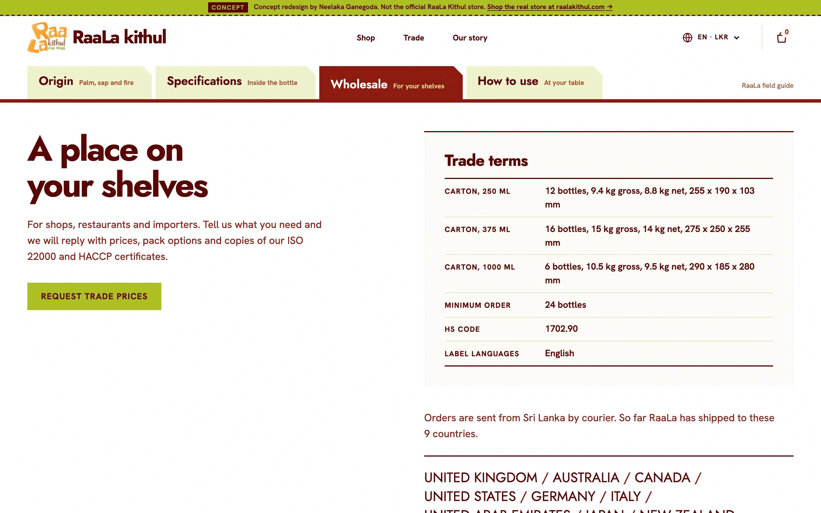
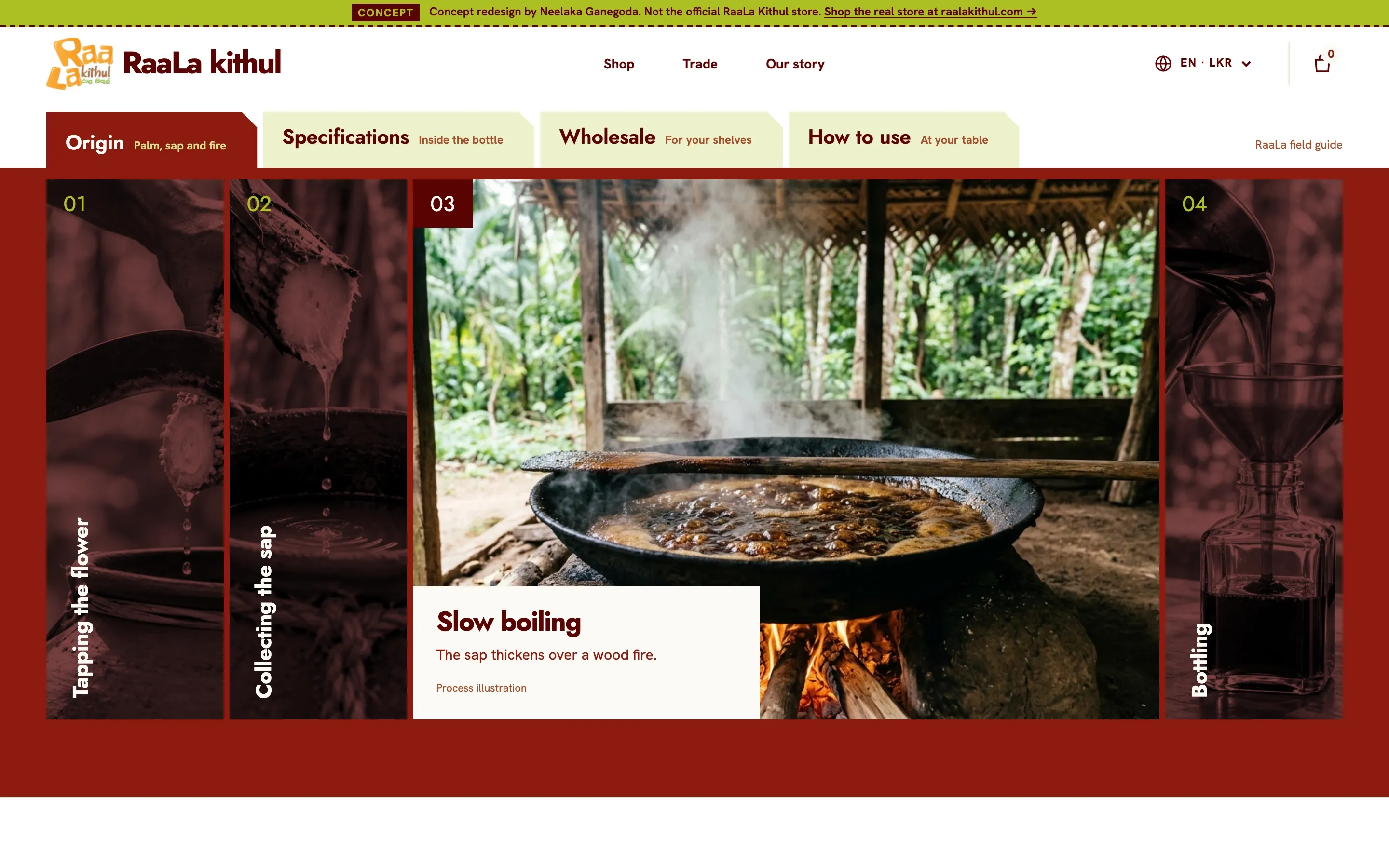
Origin, Specifications, Wholesale and How to use, shown one at a time. The page stays short and every fact stays one click away.
- 04
Two equal ways in
Shop the range and Buy for your business open the homepage at the same size and weight, and trade terms sit on the product page next to the button that asks for prices.
- 05
A buy bar that follows on phones
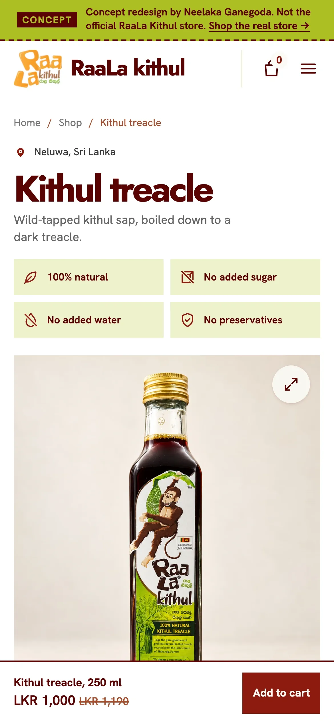
On a phone the gallery pushes Add to cart below the fold, so a bar with the size, price and button sits at the bottom of the screen from the first load.
Before / After
Process
The brief
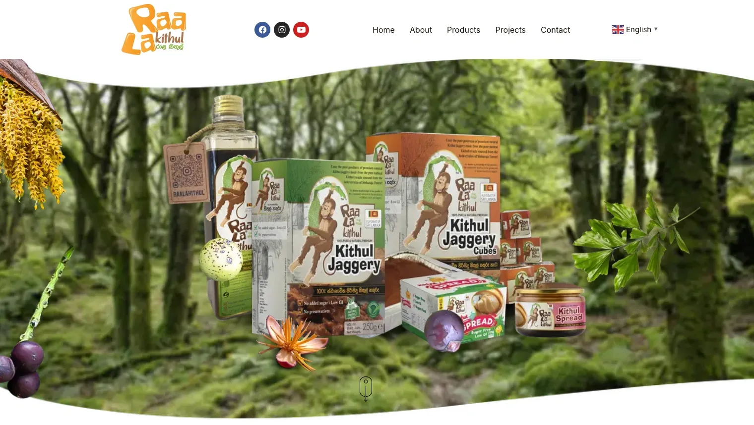
I order kithul treacle from RaaLa. It comes from wild palms around Neluwa, near Sinharaja, and it is the one I buy. The website I order it through looks dated, loads slowly, and leaves out things I wanted to know before paying, starting with which currency the price is in.
There was no client brief, so I wrote one. Two readers have equal priority. One is a home cook, in Sri Lanka or abroad, who wants treacle for curd, hoppers, tea or baking and needs the price, the size and the delivery. The other is a shop, restaurant or importer who needs pack sizes, cartons, a minimum order and certificates. The current site serves the first one poorly and the second one not at all.
I sent the redesign to the brand and did not hear back. It is live on my subdomain as a concept: a banner on every page says so and links to the real store, the cart stays in the browser, and the checkout takes no orders.
Research
I went through the current homepage and the 250 ml product page as a customer would, then again as a buyer from a shop would.
The product page held most of the problems. The price is රු1,000.00, with the Sinhala rupee sign and no code. Add to cart and Buy Now sit side by side with nothing to say how they differ. The bottle weighs 800 g under Additional information and 0.65 kg gross, 0.60 kg net in the specs above it. The related 375 ml bottle shows a 5.00 rating on a page whose own tab reads Reviews (0). The 1000 ml is out of stock, and its card offers Read more with no alternative. There are no ingredients, nutrition, storage, shipping or returns anywhere on the page.
The homepage had a different problem. The brand has real proof: ISO 22000, HACCP and Good Market marks, partners in nine countries, and Keells, Glomark, Arpico and Spar as local clients. None of it leads anywhere. A shop that wants to stock the treacle finds a logo wall and a contact link. The Facebook and Instagram sections load as two empty panels. The health copy makes claims about blood sugar and digestion with no source.
Design process
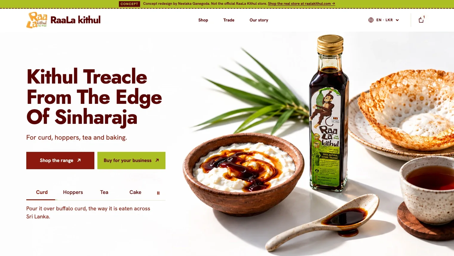
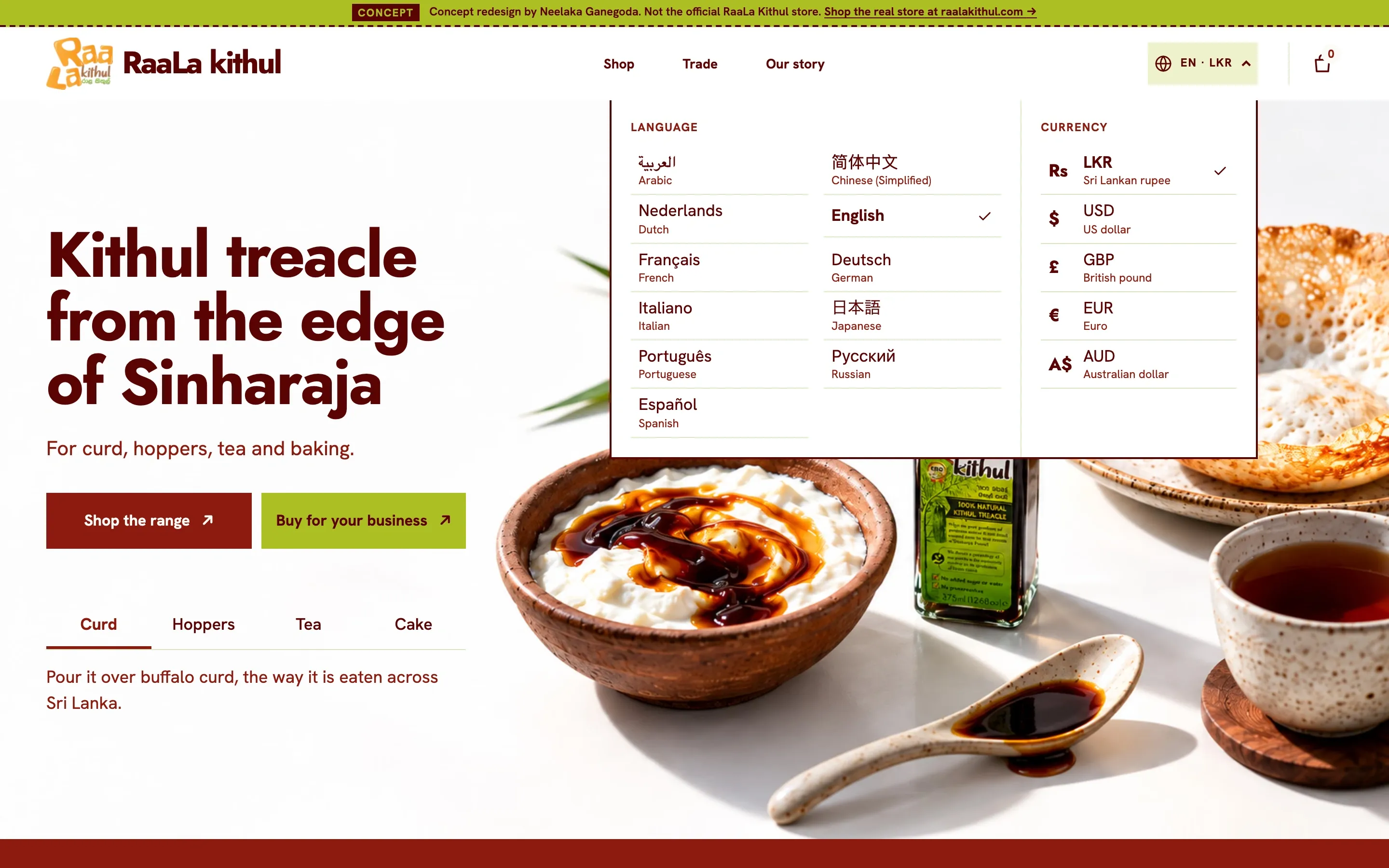
I started with three homepage directions as quick generated studies: a studio shot of the bottle with a ribbon of treacle, a miniature diorama of the palm forest, and a table set with curd, hoppers and tea. The diorama told the origin story best, and it would have made a returning buyer sit through a scene to get back to the product. The studio shot was the strongest image and said nothing about how people eat kithul. The table won because it answers the first question a new buyer has, which is what you do with treacle, and it leaves a short path back to the size a returning buyer had last time.
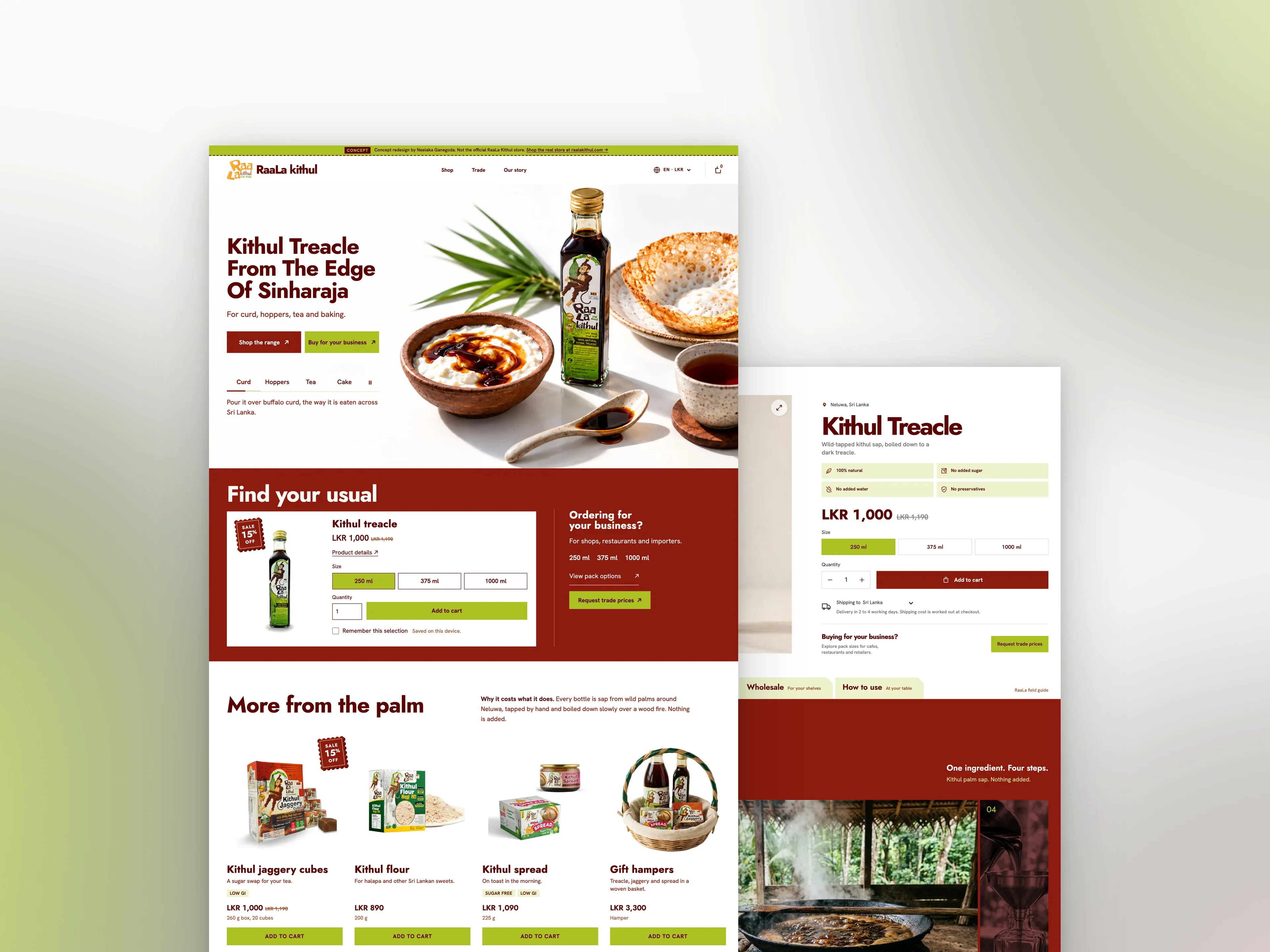
The hero has two buttons, Shop the range and Buy for your business, at the same size and weight. Retail is brick and trade is lime. Below them, four tabs for curd, hoppers, tea and cake change the photograph and one line of copy. Further down, “Find your usual” holds the treacle selector, with an option to remember the size and quantity on that device. It never adds anything to the cart by itself.
The first full build was too long: about ten and a half screens on desktop, with the certifications shown four times, the shipping countries three times and the process twice. I cut the repeats, moved “What is kithul” up, and grouped the certificates, trade terms and wholesale form together near the end, where a trade buyer can find all three in one place.
The product page got the most work, because that is where people decide. Everything needed to order sits in one column beside the gallery. On a phone the gallery comes first and pushes Add to cart below the fold, which is why the buy bar is there from the first load.
Everything else went into a field guide with four chapters: Origin, Specifications, Wholesale and How to use. One chapter shows at a time, and the tabs stay under the header while the guide is in view. Without JavaScript, all four chapters show in order.
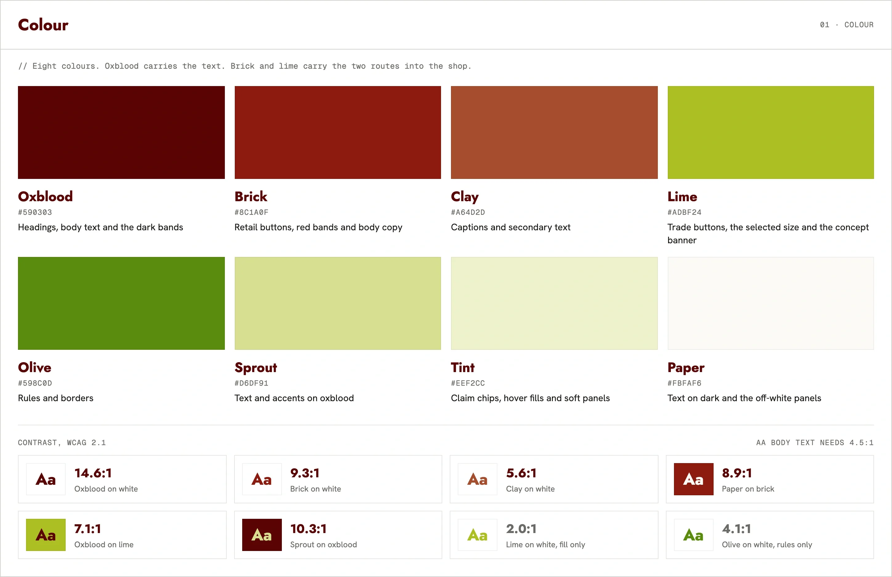
I kept the brand’s logo, its oxblood, brick and lime, and its own bottle photography wherever someone is buying. The homepage hero scenes and the process illustrations were generated with OpenAI’s image model.
Key decisions
All three sizes live on one product page, picked with a selector that updates the URL. A buyer comparing 250 ml with 1000 ml changes one control and keeps their place on the page. The image, price, bottle details, shipping estimate and buy bar all follow the choice. The cost is that one URL now carries three products, which a real store would have to account for in its structured data and its analytics.
I wrote a rule for claims before I wrote any copy: a claim goes on a product only when its own pack prints it. Low GI stays on the jaggery and the spread because their labels say so, and sugar free appears only on the spread. Nothing on the site claims to treat blood sugar, diabetes or weight, and nothing says organic. The treacle says what is in it, one ingredient, and lists added sugar, water and preservatives as None. That is a claim the label can back, and it cannot get the brand into trouble.
Where I couldn’t confirm a fact with the brand, such as shipping estimates and exchange rates, the build marks it so the owner can check it before launch. Prices and certifications are taken from the brand’s current site.
How I worked
I built it in Astro and Tailwind with Claude Code. Before any code, I wrote the brief, the claim rules and the design direction into the project, and I made the calls on concept, layout and content. A good share of the time went on correcting what the agent got wrong, mostly spacing and alignment, at every breakpoint.
What I’d do differently
I designed this without any of the brand’s data. I don’t know how orders split between home cooks and trade buyers, or what customers ask when they call or fill in the contact form. Giving both readers equal weight was my decision, made without that data.
To fill the gap, I looked at what industry-standard food sites show on a product page and used that as the baseline: nutrition, pack and carton sizes, minimum order, certificates and shipping. I also assumed many buyers abroad have never tried kithul, so the site explains what it is and where it comes from before it asks anyone to buy.
All of that is assumption. With access, the first thing I would ask for is the order history and a month of the questions that come in by phone and through the contact form. If most of the revenue is trade, the trade route moves ahead of retail. If the question people ask most is what shipping costs, the estimate moves up beside the price. Because each chapter and section stands on its own, changes like these mean reordering the page, and the design holds.
If you already have a site
This is a before and after on a store I buy from. Most of what was wrong had nothing to do with looks: a price with no currency, two weights for one bottle, a trade buyer with nowhere to go. The visual change is large. The work that mattered was deciding what a buyer needs on the page where they buy, and putting it there.
If your store has the same problems, I can go through it the same way and show you the before and after.
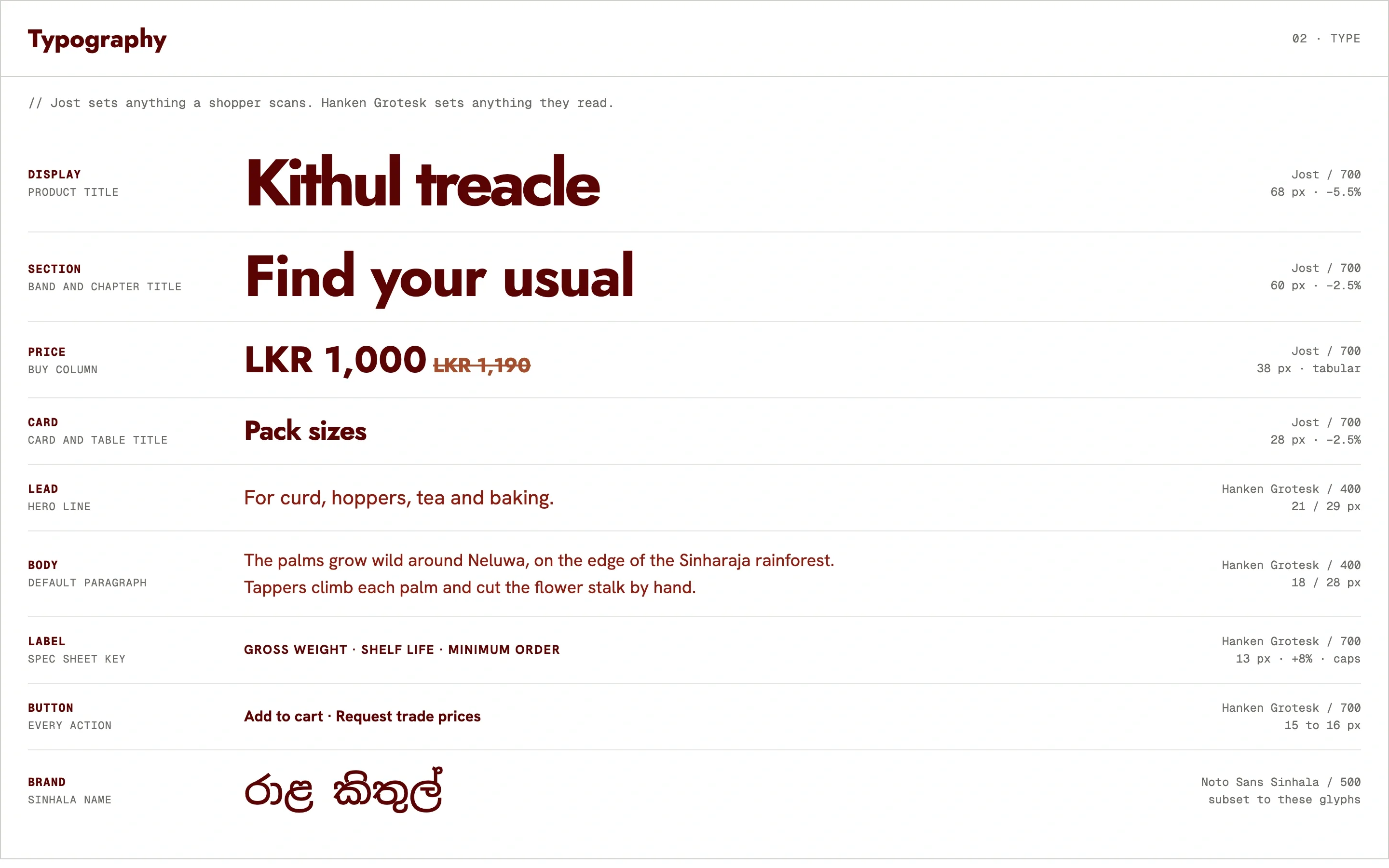
Design System
Gallery
Outcome
A homepage and product page, designed and built, live at raala.neelakaganegoda.com as a concept. On the product page, price, size, quantity and a shipping estimate sit together, with prices that convert into five currencies. Ingredients, nutrition, pack sizes, carton specs and the minimum order are one tab away. Trade buyers get their own route from the first screen.
Next Project
Built for the worst phone in the room