Non-profit
Built for the worst phone in the room
Built for the worst phone in the room case study — Non-profit web design and UI/UX project by Neelaka Ganegoda.
Overview
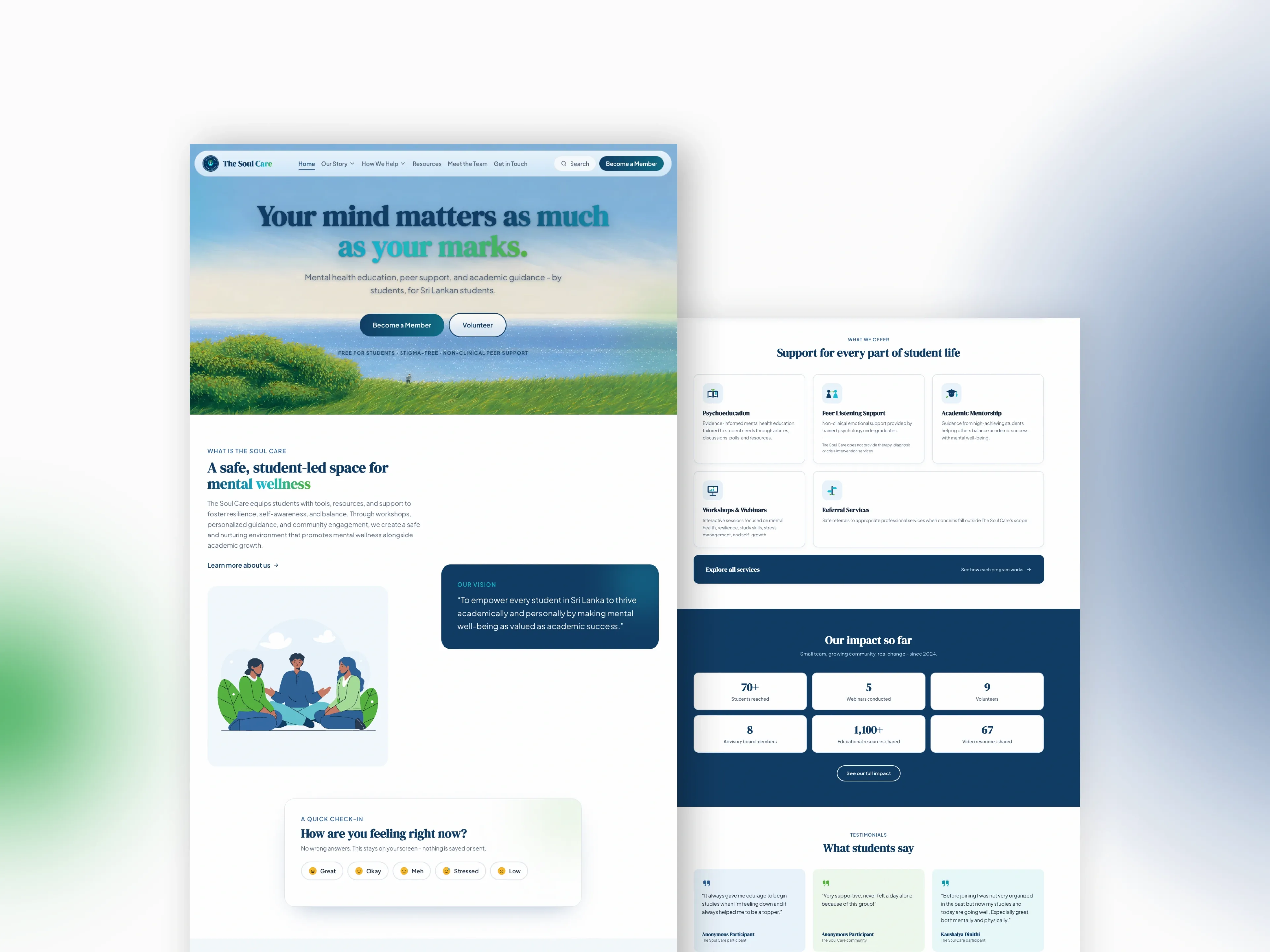
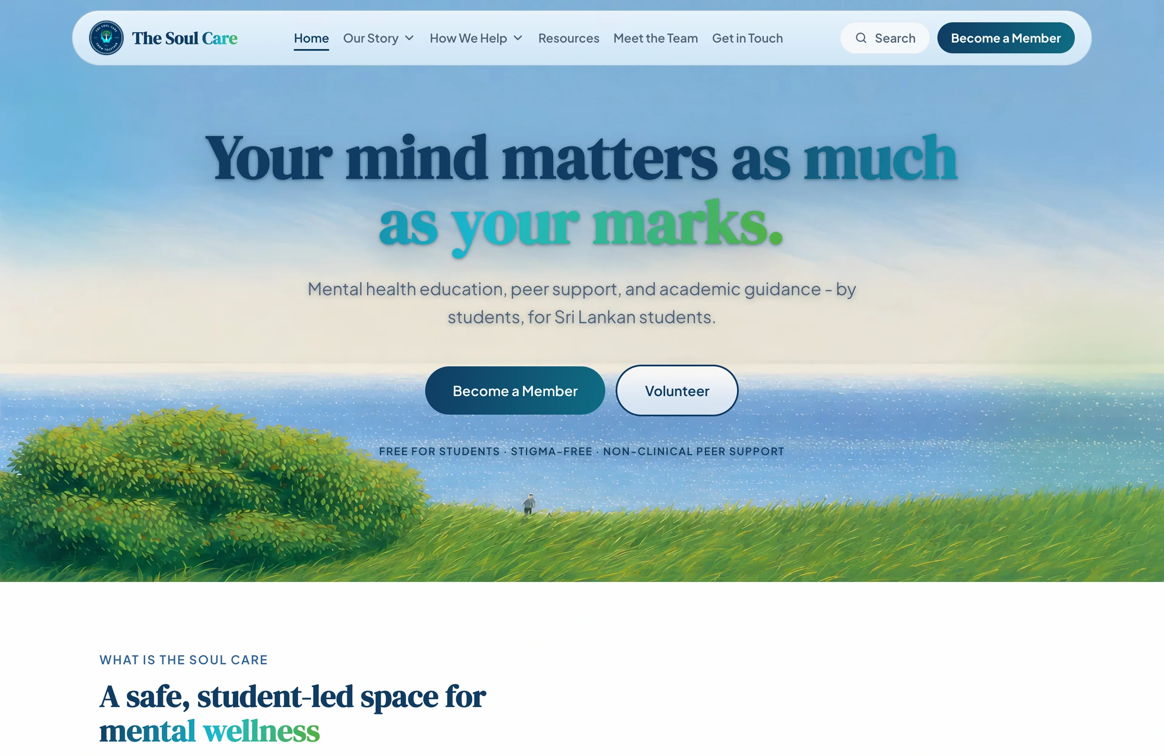
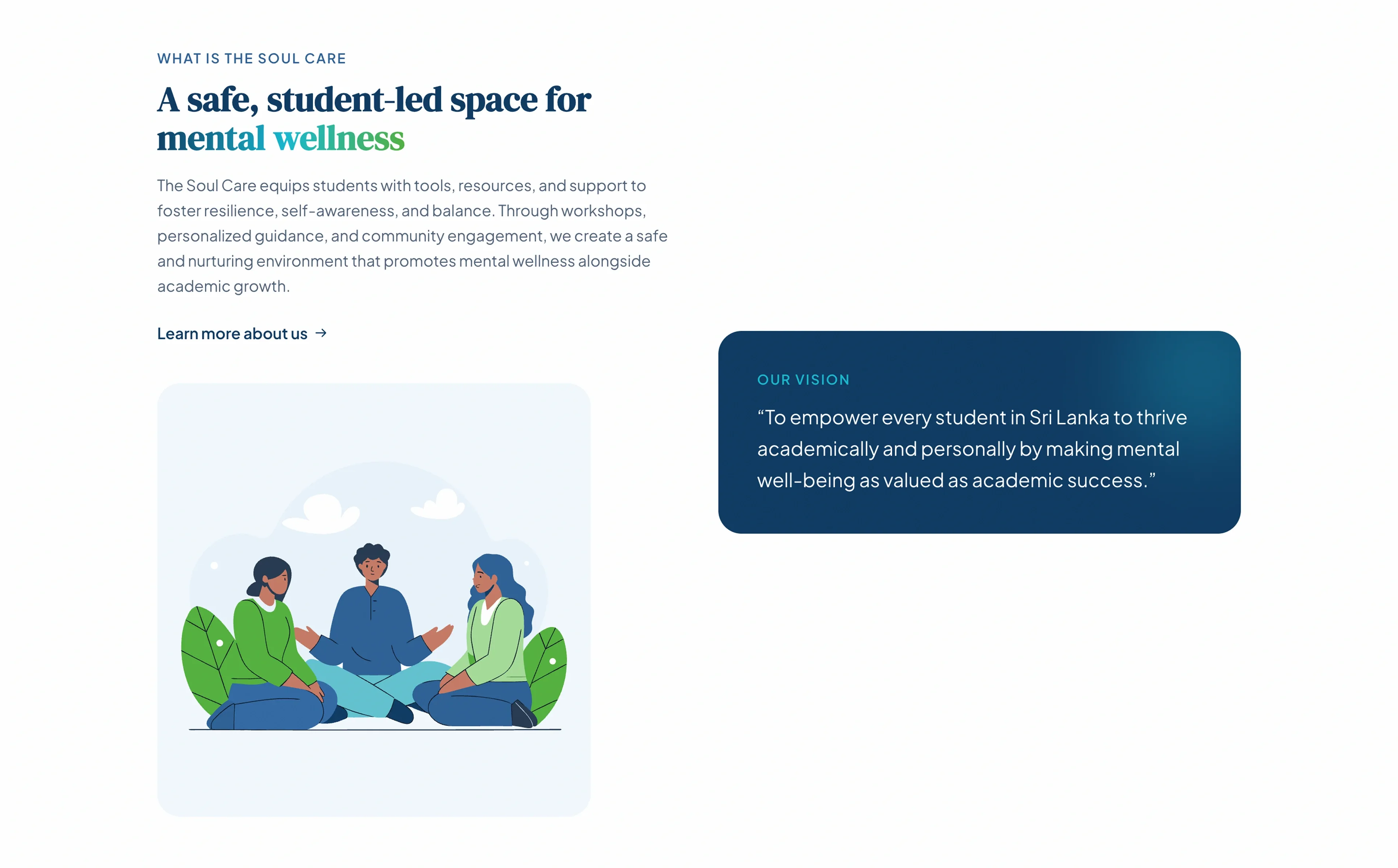
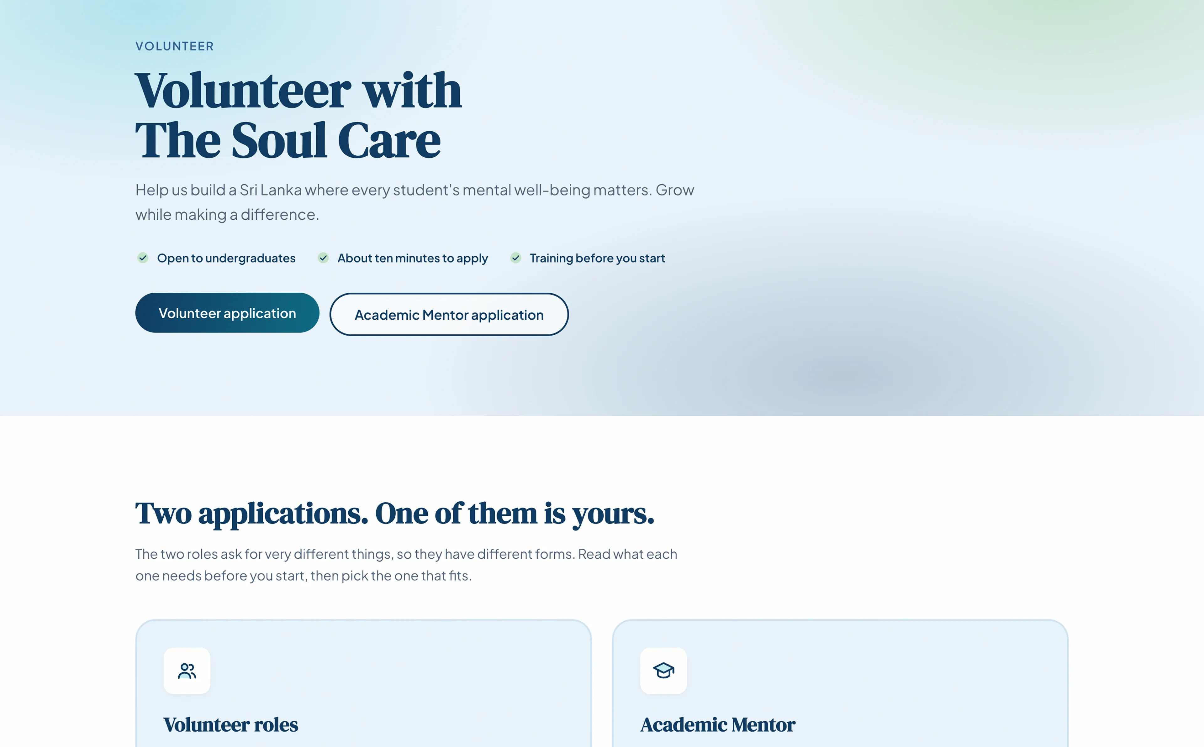
A student-led mental health initiative offering peer support, psychoeducation and academic mentorship to Sri Lankan O/L and A/L students, free. I designed and built the site and still maintain it, for an audience of teenagers on mid-range Android phones and metered mobile data.
The Challenge
Accessibility is usually a pass at the end of a project, which is why it usually fails. The people most likely to need a keyboard, a screen reader or reduced motion are the least likely to return and try again if the site does not work. Building to WCAG 2.1 AA from the first commit meant arguing for every interactive pattern before writing it, and giving up conveniences a retrofit would have kept.
Pain Points
- 01
The audience is on the worst hardware
Mid-range Android phones on metered data. Anything needing a mouse, a fast connection or a recent browser excludes the exact students the initiative exists for.
- 02
Crisis information cannot be one click away
Someone in real distress will not navigate a site to find a helpline. The number had to be reachable from wherever a reader already was, without turning every page into a warning.
- 03
A non-clinical service that reads as clinical
This is peer support, not therapy. Copy blurring that line is a safeguarding problem rather than a tone problem, so the boundary had to hold in the interface itself.
- 04
Accessibility decays without a gate
Hand-written accessibility lasts as long as the author remembers the reasoning. With no automated check, nothing stops the next change from quietly undoing it.
Solutions
- 01
Static export with a measured critical path
The site builds to a folder of files on a CDN. Fonts are self-hosted and subset at build time with metric-matched fallbacks, which is most of why layout shift measures 0.
- 02
Focus management written before the visuals
Two coordinated focus traps, focus restore that checks containment first, and inert rather than per-child tabindex. Each choice sits beside the failure that forced it.
- 03
Contrast measured, then fixed at the point of use
Two accent tokens measured 3.5:1 under small bold labels. Both are mixed 15% toward black where used, with the before and after ratios written into the stylesheet.
- 04
Reduced motion that keeps the meaning
Smooth scroll is never instantiated and every animation is gated. The reveal keeps its fade and drops only the rise, because the fade is what signals new content.
Process
The Brief
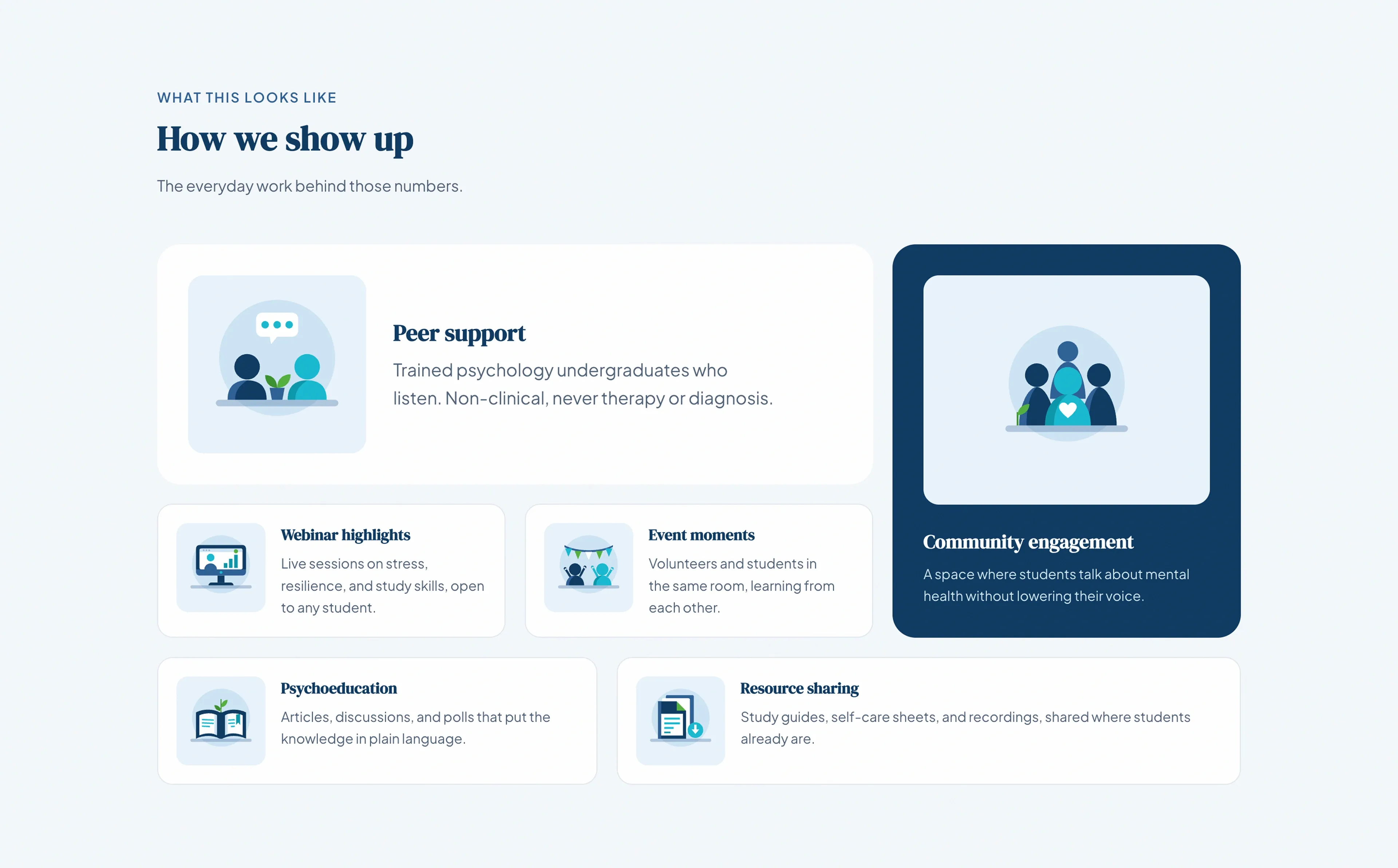
The Soul Care is run by students, for students: peer listening, psychoeducation, academic mentorship and referrals, all free. The brief was a site that could carry that credibly to Sri Lankan O/L and A/L students, and to the parents and teachers deciding whether to trust it.
One constraint decided most of the rest. The readers are teenagers on mid-range Android phones and metered mobile data, often looking for something they would rather not be seen looking for. That rules out a heavy first load, and anything that only works with a mouse. It also rules out treating accessibility as a final pass, because a retrofit fixes what a tool can detect and leaves the rest.
So the site was built to WCAG 2.1 AA from the first commit.
Research
The research that changed the most decisions was not about visual preference. It was about reading conditions.
A student under exam pressure scans rather than reads, on a small screen, in one sitting. So the article measure is capped near 71 characters, expressed in em rather than ch, because a ch is the width of a zero and lands far looser than the character count implies.
I also scored every article on Flesch-Kincaid. Eleven of the twelve read at grade 5 to 7. One reads at 11.9. To be straight about it, that score has not changed anything yet: the measure was set by the line-length reasoning above, not by the readability numbers, and the article at 11.9 is still on the list unedited. It is a check I run and have not yet acted on.
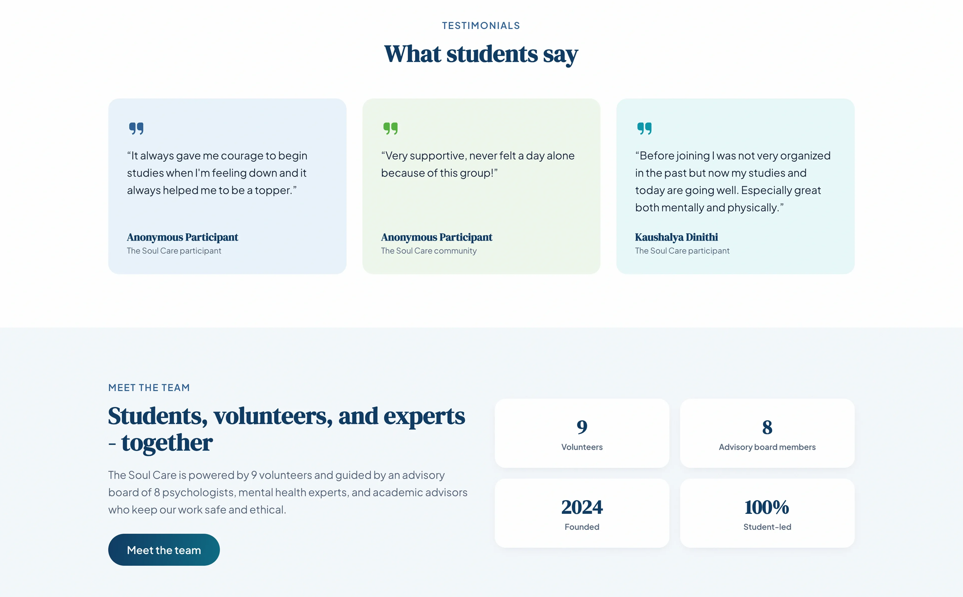
The second finding was about placement. Someone in real distress will not go looking for a helpline, so the National Mental Health Helpline number sits in the footer of every page, in a single component that exists so the wording cannot drift. It appears again inline wherever the surrounding content could reach someone who needs it: under the testimonial wall, inside the two heaviest options on the mood check-in, and ahead of the body copy on nine of the twelve articles.
Design Process
Contrast was measured rather than eyeballed, and two brand accents failed: the cyan and green tokens sat at 3.5:1 under small bold labels needing 4.5:1. Changing the tokens outright would have broken uses already correct at larger sizes, so both are mixed 15% toward black at the point of use, with the before and after ratios written into the stylesheet beside the fix.
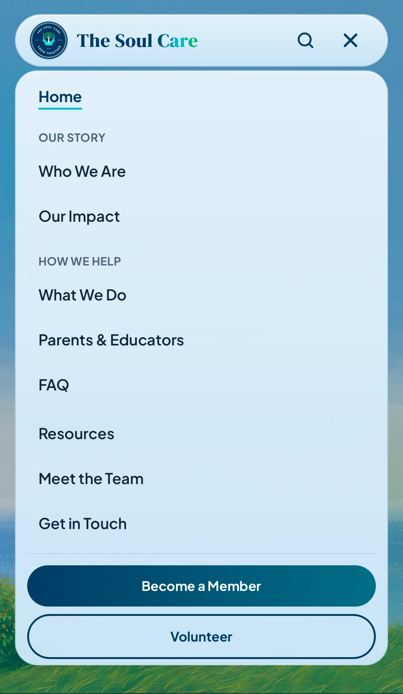
Most of the work went into focus management, because that is where sites fail quietly. The drawer returns focus to the hamburger on close, but only after checking focus is still inside the drawer, so closing by tapping a link does not yank the reader backwards after they have navigated. The drawer and the search dialog each install a tab trap and each stands down while the other is open, because two traps fighting over focus is worse than none. The closed drawer leaves the tab order via inert, after a per-child tabindex attempt silently missed the shared logo.
Reduced motion runs in three layers, and one distinction matters more than the rest. The scroll reveal keeps its fade and drops only the rise, because the fade is what tells a reader new content has arrived. Removing it takes away information, not movement.
Key Decisions
Static export came first and cascaded. With no server there is no image optimisation at request time, so every image is hand-converted to WebP and served at one size with no srcset. That is a real loss, traded for a site that is a folder of files on a CDN with nothing to fall over.
The decision I would defend least comfortably is that the animation and search libraries all mount from the root layout. That is roughly 190KB of uncompressed JavaScript on every route, including pages using none of it. Smooth scroll is not even instantiated under reduced motion, but the bytes still ship, because the import is static. I shipped it knowing that, on the grounds that the motion carries the calm the product needs. On a low-end Android it is the wrong trade, and the first thing I would undo.
The site is English only. The webinars are delivered in Sinhala and students search in Sinhala and Tamil, so this is a real gap rather than an oversight. I chose not to start, on the reasoning that a half-translated tree going stale is worse than an honest English-only site.
What I’d Do Differently
I would put an automated accessibility check in the pipeline, because there is none. No axe, no lint rule, no tests; the build is the only gate. Every decision here rests on hand-written implementation and reasoning left in comments, which decays as soon as someone else touches it.
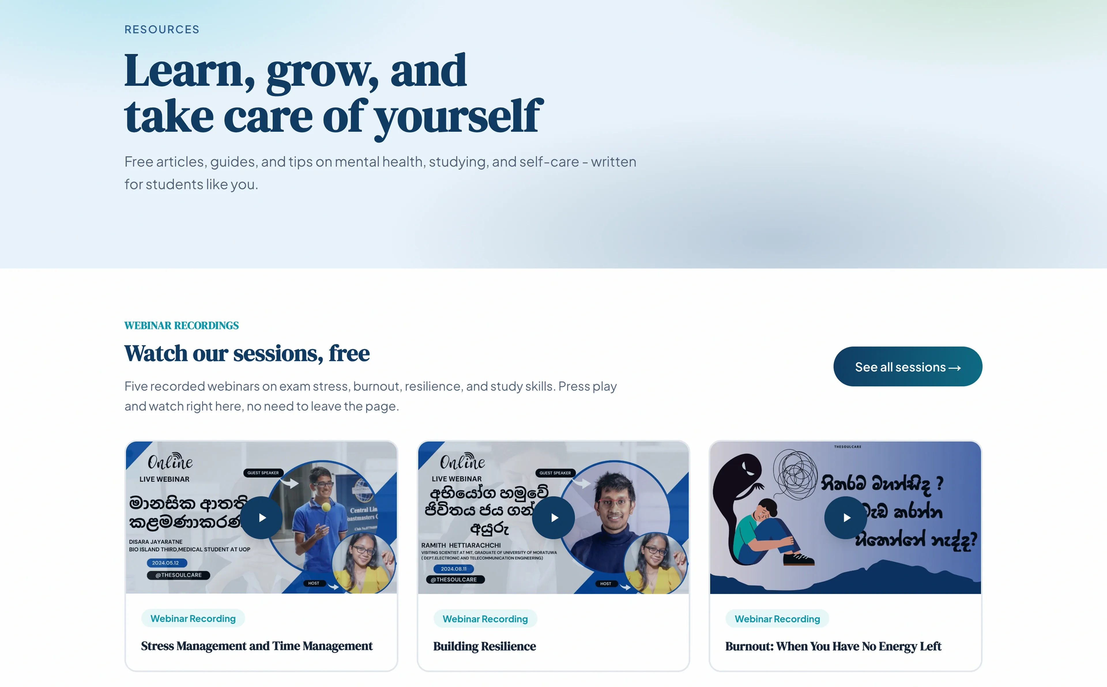
Running axe while writing this made the point better than I could. Measured on 2026-09-09 with Lighthouse 12.8.2 and axe-core 4.13.0 across six pages: SEO 100 and a layout shift of 0 on every run, and accessibility 100 with no violations on five of the six. The resources index is the sixth. It has six real contrast failures, at 3.48:1 and 3.18:1, in the two places the color-mix fix I had already written was never applied. A check in CI would have caught it in the commit that introduced it.
Several ARIA gaps come next. The desktop dropdowns open on hover and focus with no expanded state, no Escape and no arrow keys, which makes them the weakest widget on the site. Both search fields rebuild results as you type with no live region, so a screen reader user gets silence.
The webinars are the largest gap, and the one that most directly affects the people the site is for: five sessions of Sinhala-language audio with no captions and no transcripts, which fails 1.2.2 and 1.2.3 plainly.
If you already have a site
This is the work I do on one. Measure what it actually scores rather than what it feels like. Fix the contrast, the focus order and the keyboard traps. Cut what is slowing the first load, which on most sites is JavaScript that only one page needs. You get the before and after numbers, with the tool and the version that produced them, not an assurance that it is better now.
Two honest caveats. This site was built from scratch, so there is no before and after pair here to show you, only a current state. And as the section above says, I found six live failures on my own site while writing this. That is the standard I am offering: measured, named, and fixed where it is fixed, rather than claimed.
Gallery
Outcome
Live at thesoulcare.org and still maintained. A folder of static files with no server to fall over, nothing on the page jumping while it loads, and every page working on a keyboard and a screen reader. So far it has carried 12 published resources and five recorded webinars to 70+ students. One page, the resources index, still fails on contrast.
Next Project
Proof before pitch