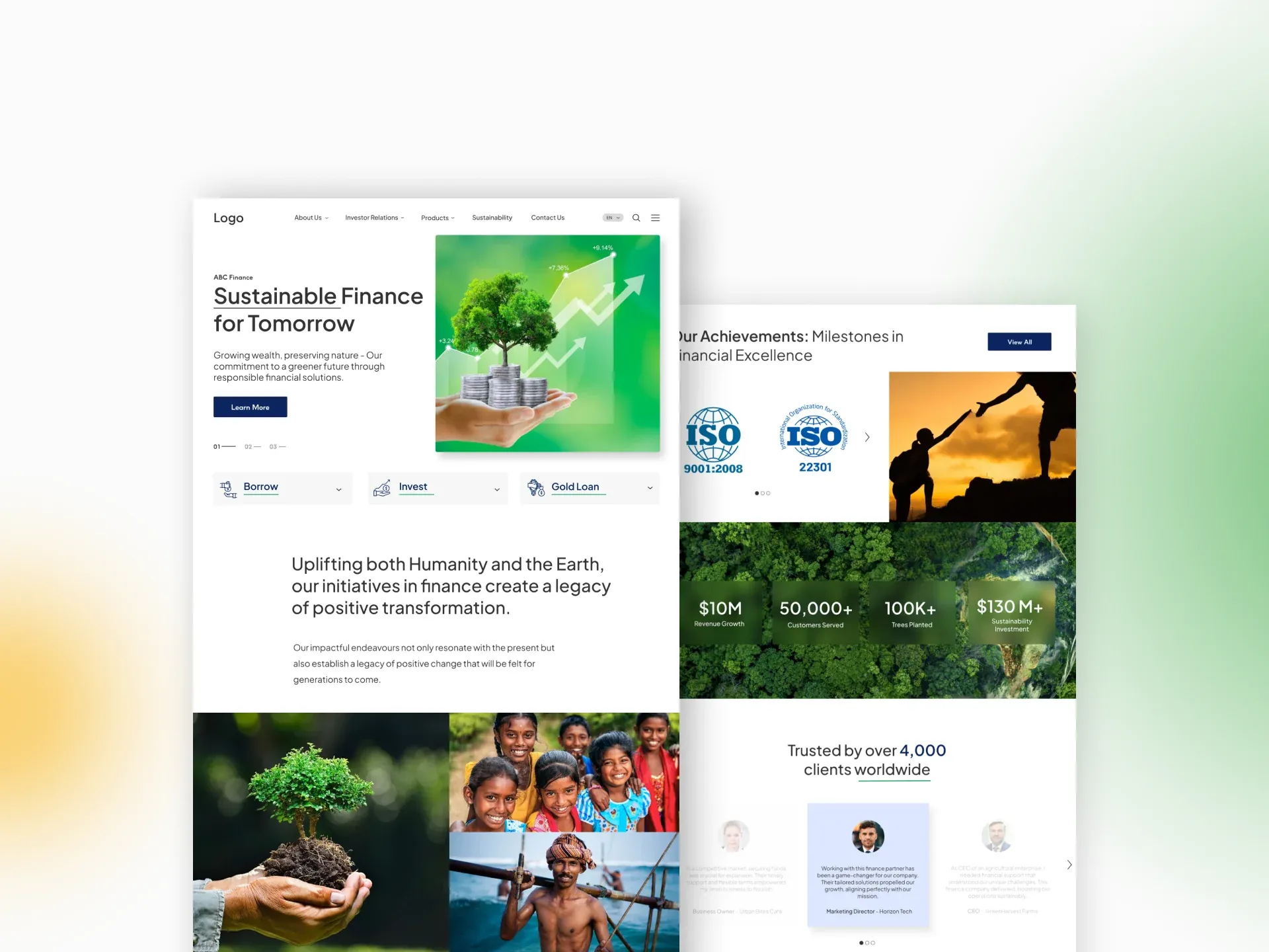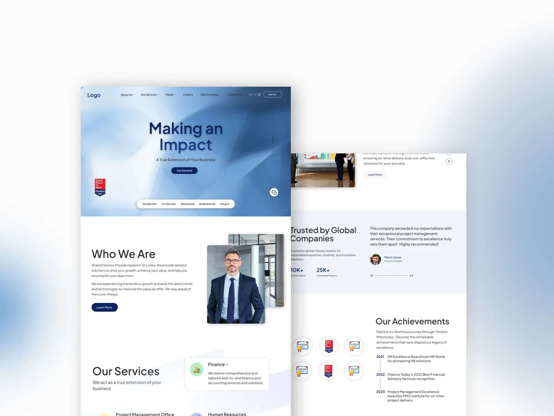
Marketing
Marketing Agency Website
Marketing Agency Website case study — Marketing web design and UI/UX project by Neelaka Ganegoda.
Overview
A marketing and advertising agency needed a new website to lead with in client pitches, one that communicated their creative confidence and personality before a prospect had read a single word.
The Challenge
The agency operated in a market where every competitor claimed to be creative and results-driven. The problem was not aesthetics. It was positioning. The site had to do the work of a first impression in a context where decisions about whether to make contact happen in a matter of seconds.
Pain Points
- 01
No visual differentiation
Every competitor used the same confident-creative-results-driven language. A new colour palette alone wasn't going to cut through.
- 02
Personality is hard to design
The agency's culture and voice existed in conversations, not on a page. Translating that into a visual system without flattening it was the core challenge.
- 03
Cold prospects make fast decisions
Prospective clients were evaluating multiple agencies in a single sitting. There was very little time to earn their attention.
Solutions
- 01
Personality-led visual language
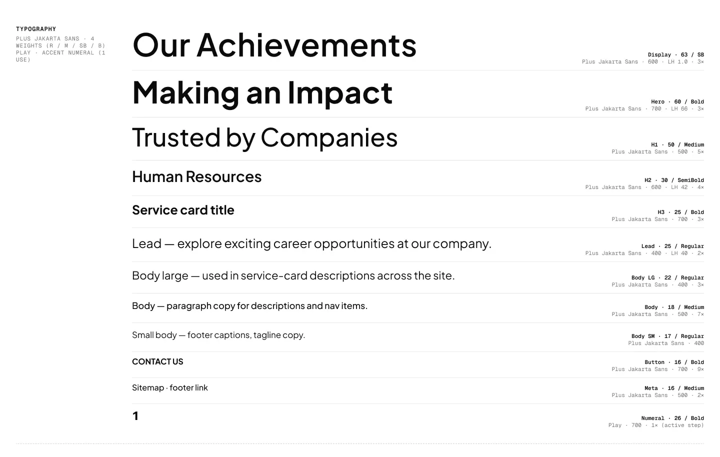
Instead of leading with credentials, the site leads with culture: bold type, fast transitions, and a tonal voice that signals taste before the reader even reads a word.
- 02
Copy and design developed in parallel
Copy direction was established alongside the visual work, not handed over at the end. The result is a site where the words and the layout reinforce each other.
- 03
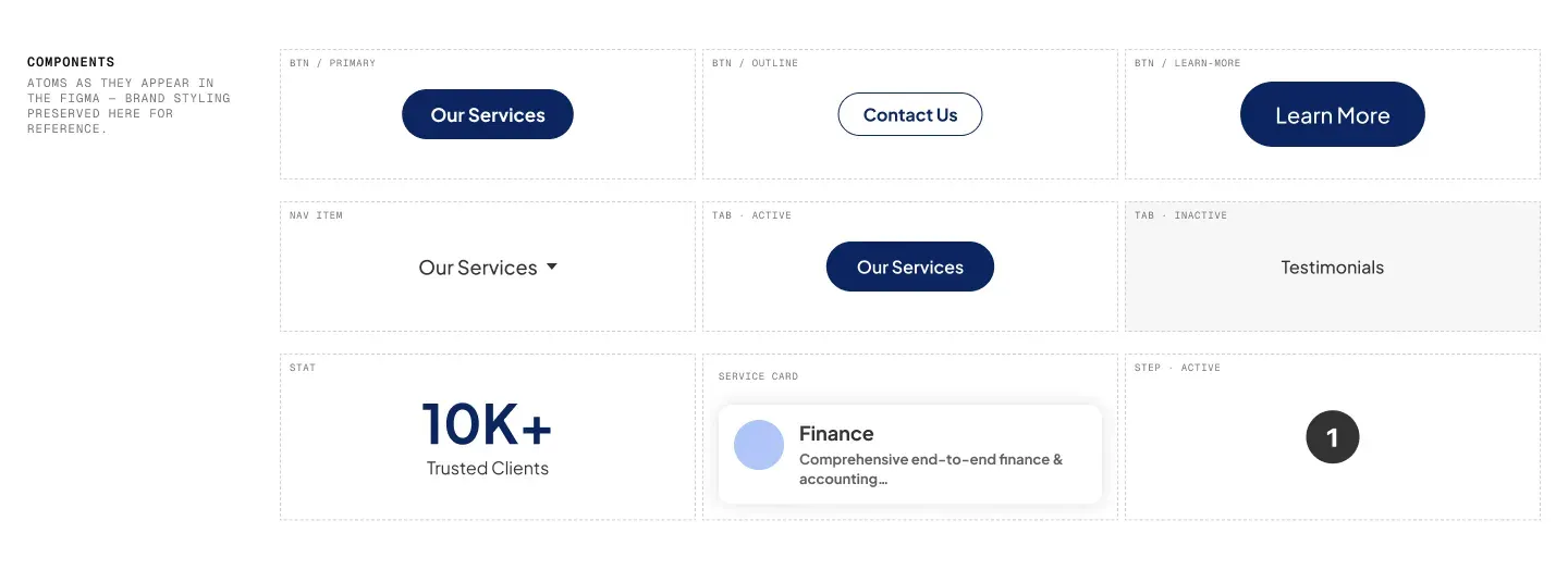
Considered micro-interactions
Hover states were designed in the first pass, not added as an afterthought. They make the site feel deliberate, which is exactly the impression a creative agency needs to give.
Process
The Brief
The agency knew what they didn’t want: another credentials-first website that looked like every other creative firm in the market. What they needed was a site that communicated who they were before the reader finished scrolling the hero.
The scope was a single landing page. No inner pages, no portfolio section, no about page. Whatever the design did, it had to do it in one shot.
Research
Before any visual work began, I ran a competitor audit covering local agencies and a broader set of internationally recognised creative firms. The pattern was consistent: most led with the same confident-creative-results-driven language, backed by a portfolio grid and a contact form. Differentiation was scarce.
The audit shaped the central design question: if everyone is saying the same thing, what does a site look like that shows it instead?
Design Process
The landing page went through multiple iterations before the direction settled. Early concepts explored a more restrained editorial approach. Later passes pushed toward something bolder: faster pacing, larger type, less conventional section layouts. Feedback was relayed back through the agency after each round, and the direction sharpened with each pass.
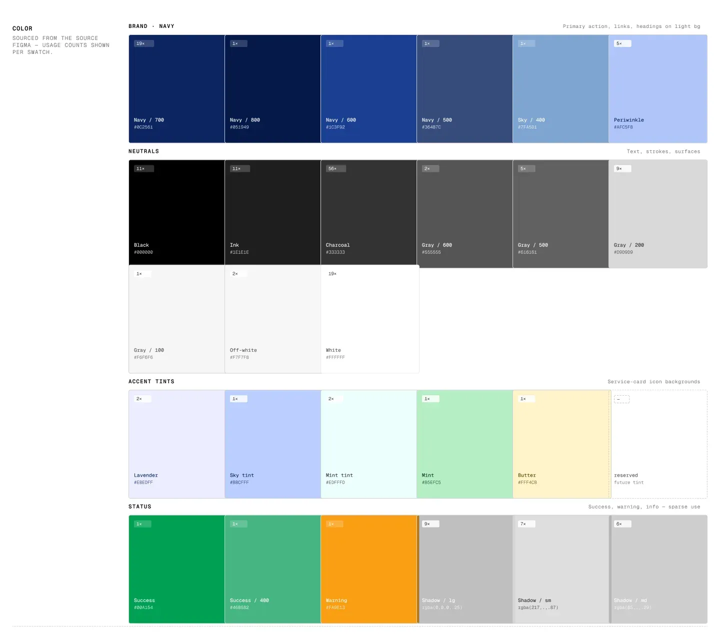
The final concept used scale and contrast as primary tools. Large typographic statements anchor each section. The colour system was kept tight and high-contrast: no gradients, no decorative texture, nothing that didn’t earn its place.
Copy direction was developed alongside the layout rather than handed in after. The two inform each other: a bold layout needs language that matches its confidence, and the reverse is equally true.
Key Decisions
The decision to lead with personality rather than credentials was a deliberate trade-off. The safer option was a hero statement with proof points, the structure prospective clients are trained to scan. The chosen direction bet on the idea that the right kind of client would respond to taste before they responded to a service list.
Micro-interactions were designed in the first pass rather than added as an afterthought. That distinction matters. It changes how the site reads from a considered product to a designed surface, and for a creative agency, that difference is the message.
What I’d Do Differently
All client feedback came to me secondhand, filtered through the agency. I received interpretations of what the client said, not the client’s actual words. That makes it genuinely difficult to understand whether a direction change reflects a real concern or a misreading of the brief.
If I were doing this again, I’d push to be in the room at key feedback points. Direct access to the client at the brief stage and at first presentation would have given me a clearer understanding of their actual voice, which is precisely what personality-led design depends on.
I also didn’t design for mobile. That is a real gap. First impressions from prospective clients increasingly happen on a phone, and a site that only works on desktop is only doing half its job.
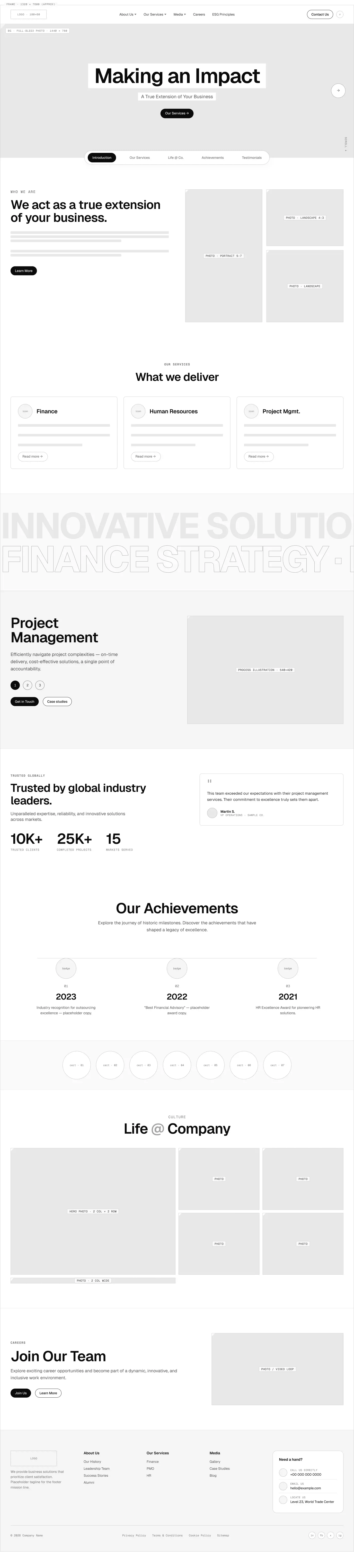
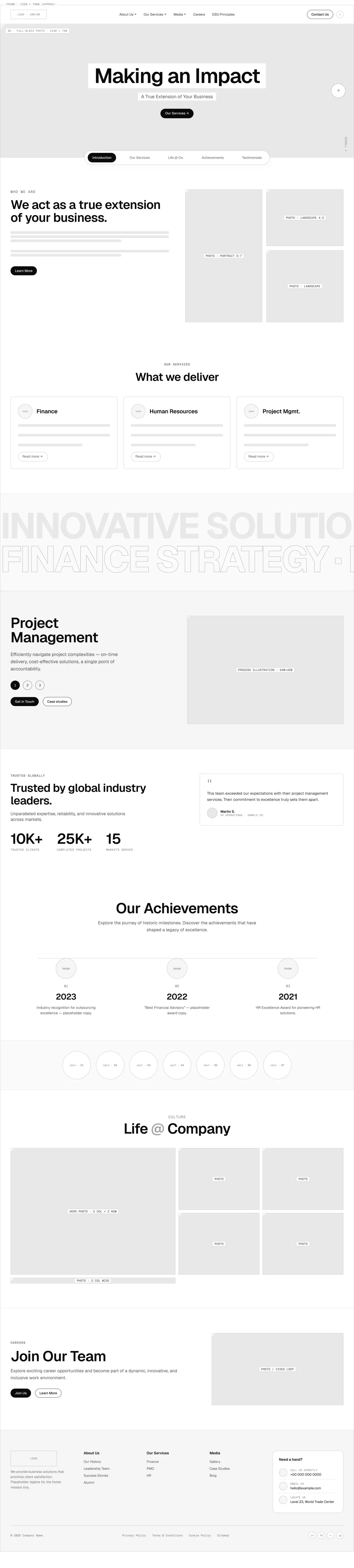
Wireframes
Low Fidelity
High Fidelity

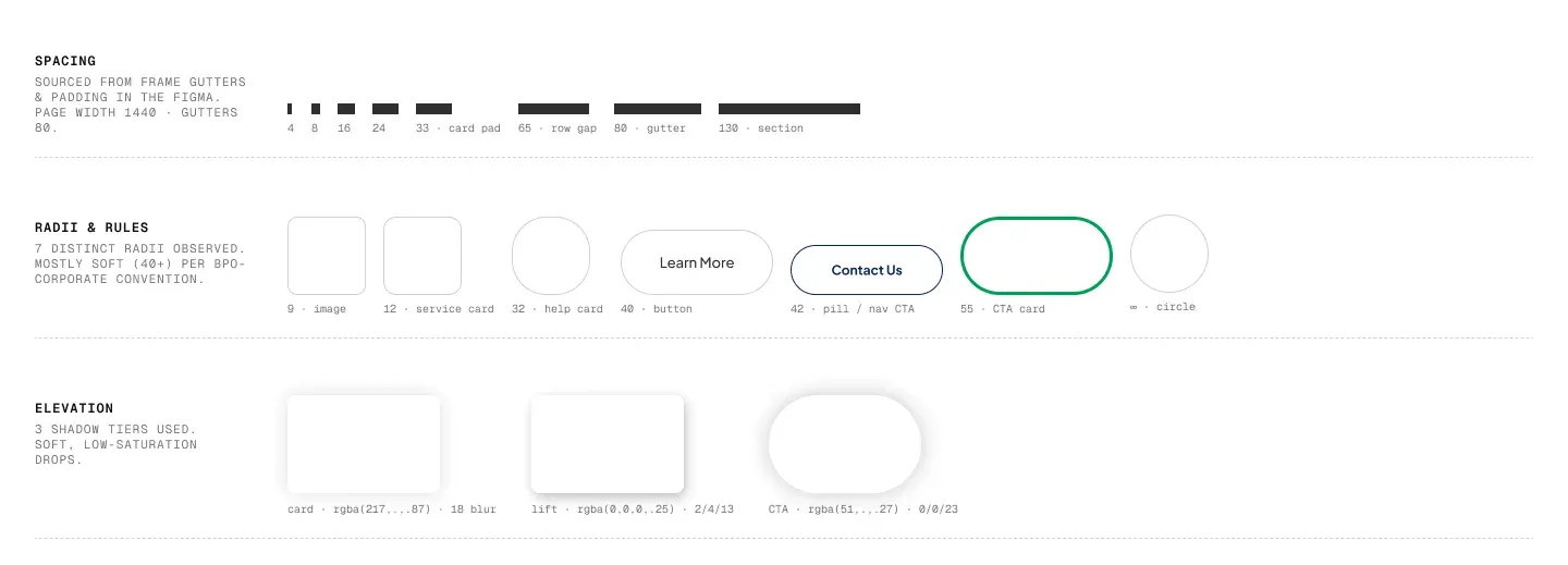
Gallery
Outcome
A complete landing page design delivered as a Figma handoff. The visual system covered typography, colour, components, and interaction patterns. The project did not proceed to development after the design engagement ended.
Next Project
Finance Brand Identity & Website